| Database Solutions - Hints & Tips | ||
|
|
||
|
||
| Tool
Tips for Command Buttons
The Problem: Tool tips for panels are defined at the same time a panel is defined. Tool tips for command buttons however are not as simple in their declaration. Currently, to create a tool tip for a button, a button must have;
This is all very well whilst it is required to create a tool tip for a button that contains a Glyph, but in a great deal of cases buttons are defined to hold some simple text and have their types defined as string. This week’s tip is about how this can be worked around. We shall also see how tool tip messages can be set dynamically. The Solution: The workaround still requires a button to have its type defined as an Image (any source). By making the button very narrow and using a dummy Glyph the user needn’t know that a Glyph is being used. An associated label is then painted adjacent to the button, and it is this label that will hold the button’s text. When a label is associated with the button field (i.e., renamed as the button’s label) and painted as a neighbour, the button becomes enhanced. The label and the narrow button are displayed as one button giving the impression and behaviour of one widget. The tool tip text is defined in the standard way as a Message and is given the same name as the glyph. For tool tip messages that can be set dynamically, we use %% in the message to paste in the value of a local or global variable. Example: In the IDF paint a new command button with the name ’Maintenance’, and the following properties;
^U_NONE implies a Glyph is being used but we will not declare a Glyph with that name. Instead what fills the button is the !format picture, but because the widget is pasted so small the button appears blank.
Next, using shift, select both the button and the label together, use the right mouse button on the label again and select Label->Rename As: MAINTENANCE. This will associate the label with the button. The two widgets will now appear as one button. The button’s text is a little off centre. Its appearance can be tweaked a little by changing the horizontal alignment of the label’s text and/or resizing the labels width. Create a new Message in the library. Give the message the name U_NONE, and for the message text;
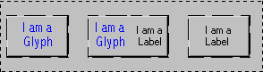
All that remains then is to compile the form and test (Note, if you test in a run time environment it might be necessary to update your DOL file). Notes: Although a dummy glyph is used you can use a real glyph along side a label. The benefit being that those buttons with glyphs have the same font type and display as regular and standard buttons. Tool tips for all three of the buttons featured below can be catered for.
|
||
|
|
||
|
Copyright ©2000 OCS Consulting plc |
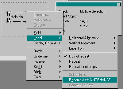 Now
paint a label to the immediate right of the button, don’t rename
it immediately as you’ll have to rename it later. This label
should measure 2 cells in height and 9 cells in width. Set the text
in the label to something meaningful for the button, e.g., Maintain.
Clicking the right mouse button on the label select
Label->Vertical Alignment and set this to centre.
Now
paint a label to the immediate right of the button, don’t rename
it immediately as you’ll have to rename it later. This label
should measure 2 cells in height and 9 cells in width. Set the text
in the label to something meaningful for the button, e.g., Maintain.
Clicking the right mouse button on the label select
Label->Vertical Alignment and set this to centre.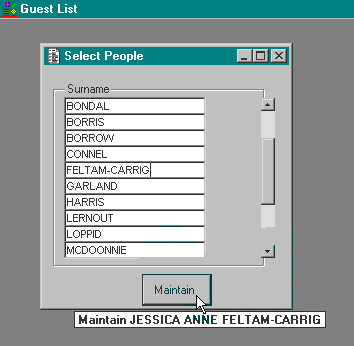
